Whether its a web page; a banner; an ad (basically anything graphical), it can be easy to lose focus on what's actually standing out, especially if there's a lot going on
I was blind, but now I see
This is a trick I learned many years ago and I still use it to this day. It's so simple, yet so effective...
Blur your image!
- Take your image (or screenshot of your web page) and chuck it in Photoshop (other image editing software is available ;)
- Blur it (Photoshop = Filter > Blur > Gaussian Blur)
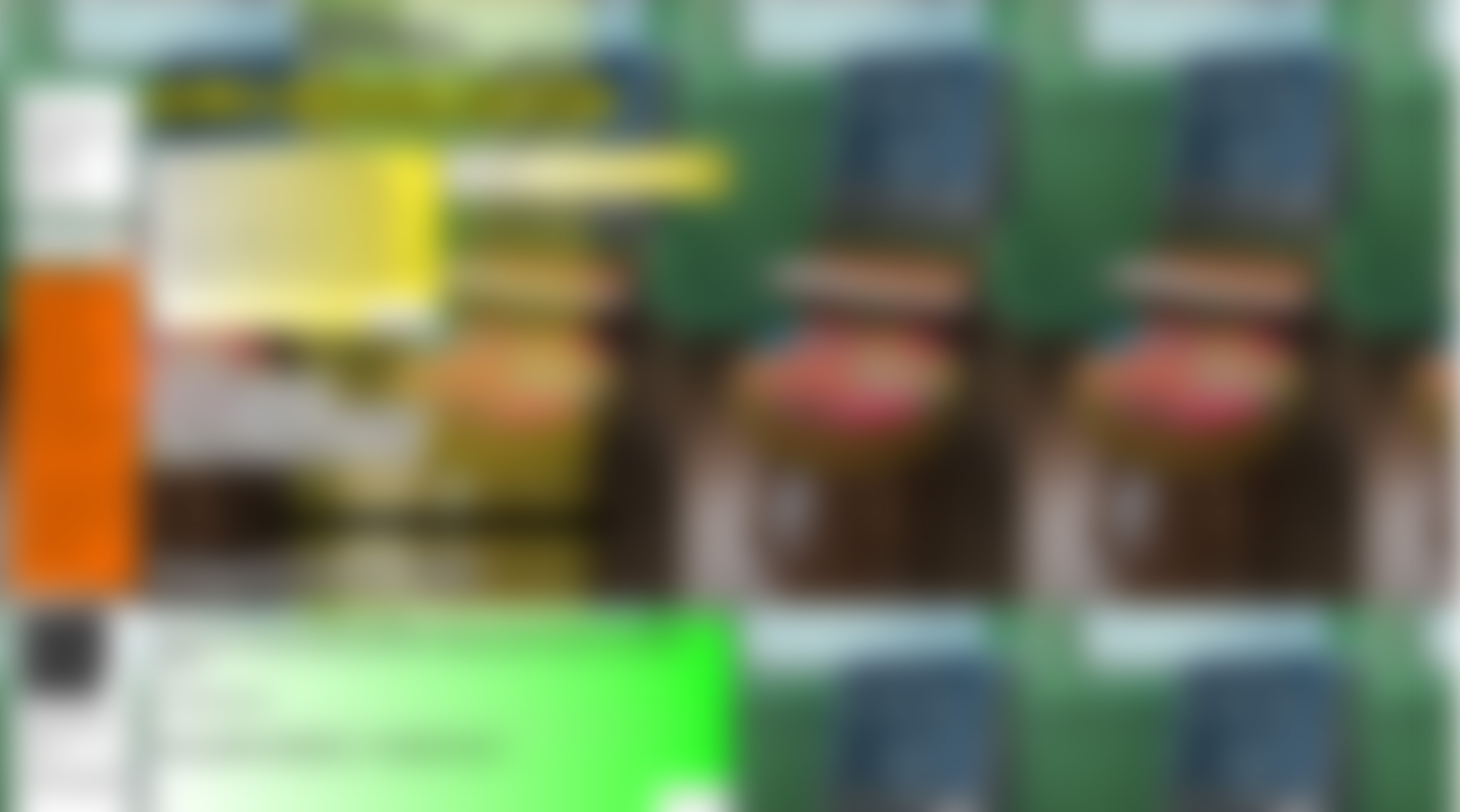
Before...
After...

What the fruit and nut is going on?
Every user is different and so are the things that make them want to buy, meaning it's all down to personal preference
Some people have a focus on "Reviews"; some have a focus on "Free Delivery"; some prefer discounts, and some prefer nice images
By blurring the image, you're removing these personal preferences that users are either conciously or subconciously drawn to, creating a completely level playing field!
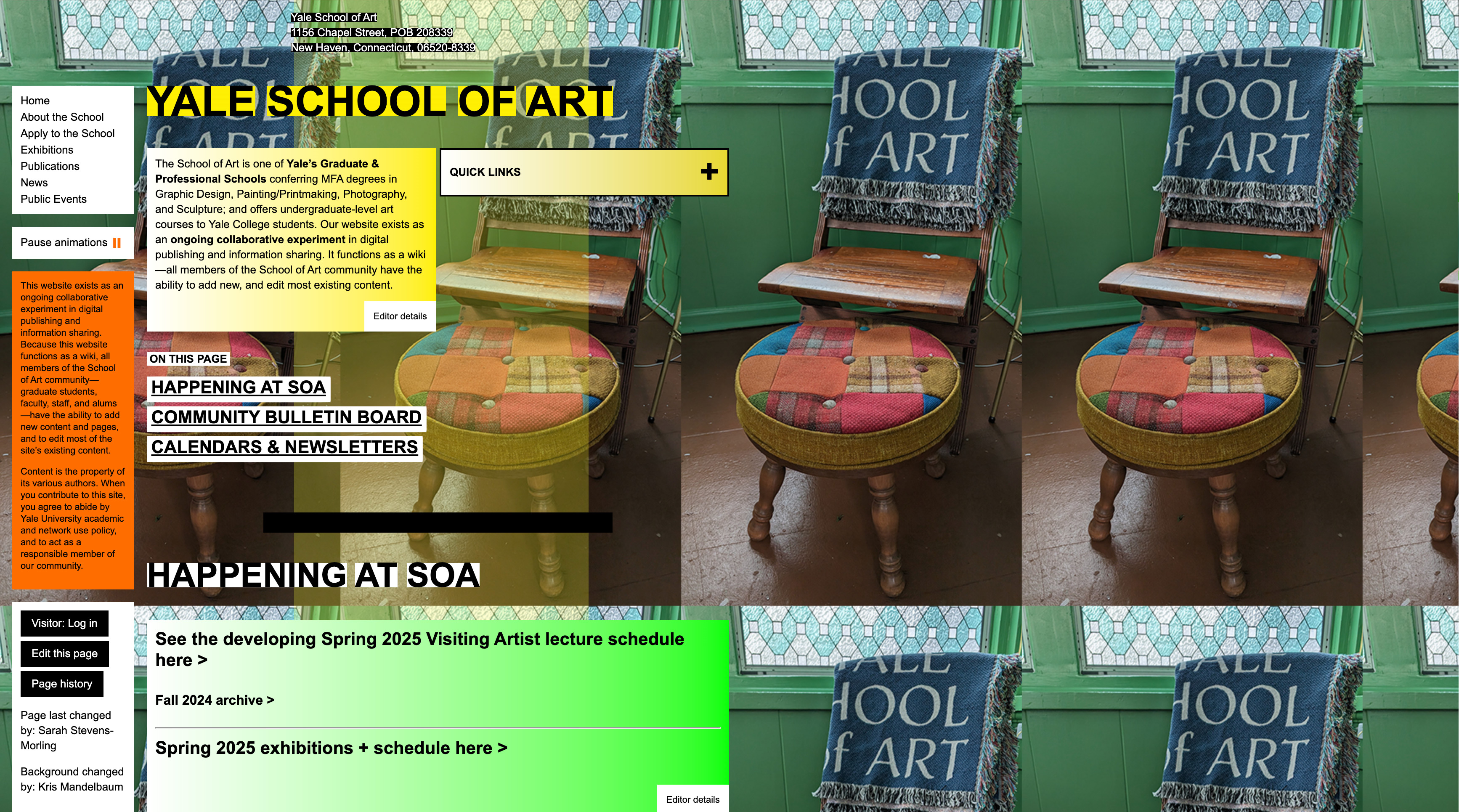
What's standing out?
Now that we have our blurred image, it's easy to see what's standing out on the page...

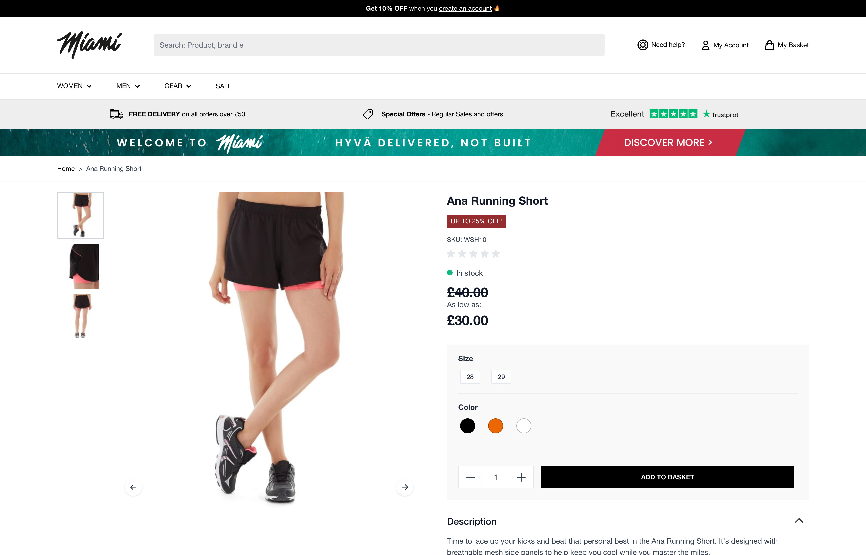
The 3 main things:
- Add to basket button
- Product image
- Top promotional banner
As well as those we have:
- Dicount badge
- Product pricing
- Product options
Now the question becomes...
What are your key call to actions?
Obviously you know what your key call to actions are, but this super simple trick could well surprise you!
Unfortunately I can't give you an example with images so you'll just have to take my word for it, BUT....
I was asked to look at a site a while ago and give some feedback on the look and feel of the site's product page. I instantly went to doing this blur trick and within 5 minutes, I showed them that one of the most important parts of their PDP was a returns button
Unforgivable? Not quite, but yeah pretty bad
Anyway, I hope this simple little trick can give you a little more insight and feedback into what's going on in your designs
How not to do it
I'm not entirely sure whether this site is just so bad it's good, or whether it really is just as horrific as it looks. Either way, I'm just gonna leave this here...